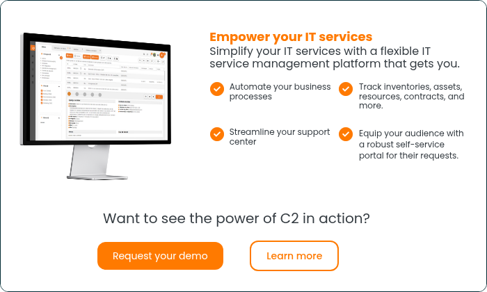
When you think of tools that can help your business; the dashboard should be the first one that comes to mind. Dashboards are an indispensable instrument for any business. Decision making will never be easier; your business uncertainties will be minimized, and the overview of your projects will be optimised, all that with the help of a customized dashboard. By evaluating you projects performances, follow-ups will prove to be the simplest task ever. Also, it’s a tremendous help four your team spirit, with a better flow of information, it also reduces tensions related to the lack of communications between colleagues. The entire team has the same information at the same time that is the greatest strength of utilising any dashboards.
What can a great dashboard do for you?
A great dashboard allows, with only a glance, the entire view of all relevant projects and activities information. Ultimately your dashboard must be useful, simple and practical :
- Useful: By enabling the person in charge to assess a situation better and ultimately optimising their decision-making process.
- Simple: By facilitating the extraction of actionable information, through a synthesised support.
- Practical: By becoming an indispensable tool at the service of the management structure with its animated dimension.
Selected KPI relevance
To create your dashboard, you must subsequently have selected key indicators from which you wish to obtain information on a constant basis. To identify a good indicator it needs to have four essential characteristics; it must be relevant, executable, precise and simple. It is essential that the indicators’ measure be of the highest quality, very accurate and especially easy of interpretation and use. When designing your dashboard, identifying your indicators base on those four characteristics will allow you to determine the best object to measure and also collect a precise representation of index to maximise your dashboard performances.
Create an exceptional dashboard in five easy steps
1) Define your dashboard update frequency
According to your service activities, it may be daily, weekly, or any other. Pay attention to the number of resources necessary according to your frequency updates chosen.
2) Define the best indicator to illustrate your SLA (service level agreements)
In the case of customer service or support, the key indicator is the response time and requests resolution time. The aim is to deliver solutions that respect your service level agreements (SLA) established with your customers.
Keep in mind to always use measures aligned with your business objectives.

3) Define relevant sub-indicators
These will need to be aligned with your performance indicators illustrating your service level objectives.
It’s the most important step in your dashboard creation and implementation. It’s here that you define and sort all the granular sub-indicators of your performance indicator that defines the objectives of your service level agreements (SLA).
4) Analyze your dashboard efficiency and add properties
The analysis of your dashboard functionality will allow a better customization and top execution. The addition of control features will allow updates while ensuring optimum performances. Make sure you use clear and precise properties to help your comprehension of your users.
5) Determine your choice of graphics
For each indicator, select the correct form of graphic to use (histogram, scattergram, pie chart, etc.) and the most representative. The graphic should be visually compelling to maximize your decision-making process, anticipation or corrections. Avoid graphics too complicated and difficult to read, 3D graphics are not always the smartest idea.